M-Bau Web Project
M-Bau Web Project

BRIEF
Web Design:
Crafted with aesthetic excellence to provide a visually appealing and user-friendly experience.
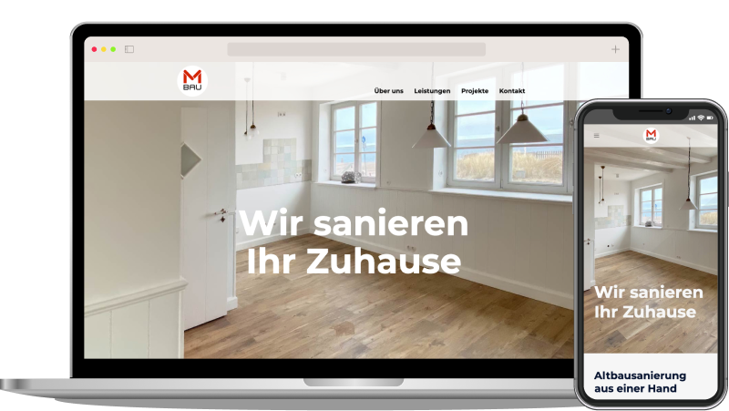
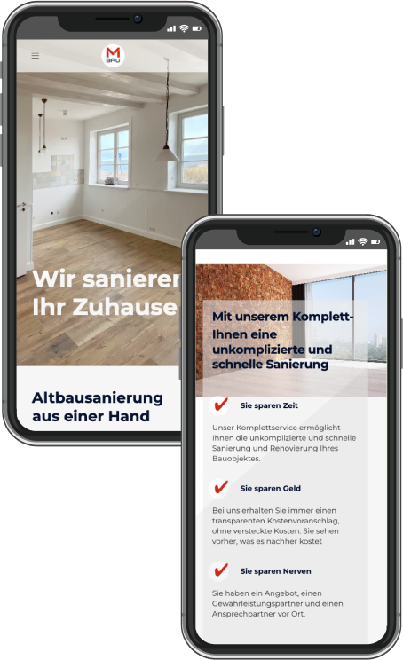
Responsive Layout:
Seamlessly adapts to smartphones, tablets, and desktops, ensuring an optimal viewing experience across all devices.
WordPress Implementation:
Utilizing the robust WordPress platform for a flexible and customizable build, tailored to specific needs and goals.
Optimization:
Enhanced performance through improvements in loading speed, bolstered by essential SEO practices to maximize visibility, and stringent data security measures to ensure integrity and confidentiality.
Optimization:
Enhanced performance through improvements in loading speed, bolstered by essential SEO practices to maximize visibility, and stringent data security measures to ensure integrity and confidentiality.


Challenges
The original website’s content was cluttered and disorganized, leading to confusion among visitors. Information was scattered, making it difficult for potential clients to comprehend the construction services offered.
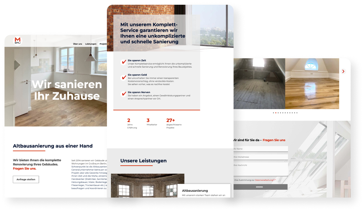
Solutions
By restructuring and categorizing the content into logical sections, we enhanced navigation and understanding. Clear headings, concise descriptions, and intuitive design elements ensured a user-friendly experience, allowing visitors to easily find and digest information about the construction services.